Paul Liddelow · Senior Product & Design Systems Designer

Products and systems with a little bite.

Hello, I'm Paul Liddelow. For more than fifteen years in UX I've designed for government, an airline, premium retail and a university, and I've worked with consultancies and startups in Melbourne and San Francisco. Today I'm on the Transformation team at the State Revenue Office, working on transformation projects and design systems, and I take on product work wherever it lives.

15+ years in UX Melbourne, AU NN/g UX Certified
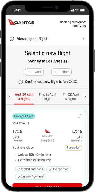
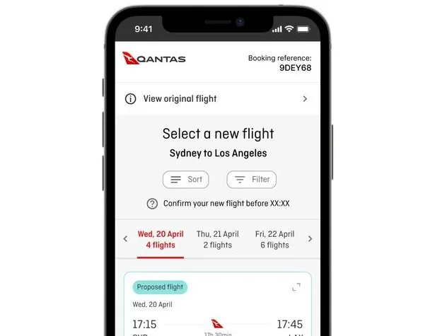
The Qantas rebooking screen I designed: select a new flight, with sort and filter, a date strip and a proposed flight card

Selected work

Three projects: a design system, an airline rebooking tool and a portal for 50,000+ members.

Design systemGovernment

SRO Victoria pattern library

It took about a year to win a team for a pattern library. I created the Figma library with another UX designer and our UX lead, three developers and a tester built it in a month, and it was released in early October. The first project team is using it now.

Organisation
State Revenue Office Victoria (SRO)
Role
Senior UX/UI Designer, permanent, Melbourne, hybrid
Period
2024 to now
Status
Live since early October 2026, first project team adopting
Usability
First dashboard: 6 out of 7 for ease of use, 78 on the System Usability Scale
Read the case study ↓
Product designAirline

Qantas rebooking for disrupted flights

I usability tested the live, third-party rebooking tool, then designed the interface and flows for Qantas's own version, built on its APIs and the Runway design system. It shows customers the right information at the right time when their trip is disrupted. I also worked on the digital boarding pass, passport scanning and 270+ UI updates to web check-in.

Role
Senior Product Designer, contract, remote
Period
Dec 2021 to Feb 2024
Read the case study ↓
UX redesignFinancial services

Maxxia member portal redesign

As the only UX designer, I delivered the member portal redesign for 50,000+ members in 12 months, starting with hundreds of clickstream recordings, interviews and workshops. I set up the design system, delivered 200+ responsive screens and trimmed screens and steps from the expense claim flow. A renewal options feature for novated leases generated over $60k in potential leads in its first few days. The work led to two more UX and UI projects at the group.

Role
Senior UX Designer, contract then permanent, Melbourne
Period
Aug 2018 to Dec 2021: a 12-month redesign, then two follow-on projects
Team
Distributed agile team of about 10, as the only UX designer
Read the case study ↓
Case study · Design system

SRO Victoria pattern library

It took about a year to get a team on it and a month to build it. Getting old and new components to live together is the harder job.

Organisation
State Revenue Office Victoria (SRO), Melbourne
Role
Senior UX/UI Designer. Built the Figma library with another UX designer and our UX lead, and maintain it.
Team
UX lead, another UX designer, three developers, one tester
Winning the mandate
About a year
Build in code
One month
Status
Released early October 2026

The problem

Multiple teams across SRO work on digital products, and we kept meeting inconsistencies in design, especially in foundations such as colour. Each team used its own pattern library in Figma, which produced a mismatch in visual language and user experience across platforms, and components could not be copied from one app to another.

Separately, the business planned upgrades to one of its customer-facing apps, which was running on an older version of Angular that had not been updated in some time.

What changed minds

I escalated the Angular version issue, and the HCD team argued that the upgrade should move the app to a current Angular version and a refreshed pattern library, to keep accessibility and security up to standard. Two things made the case land.

  • Standards the business already cared aboutAccessibility and security were framed as reasons to modernise, not as design preferences.
  • A first use already under wayA new customer-facing portal was being designed with the new components we had drawn in Figma.

What we built

The pattern library was developed specifically for SRO projects. It is based on the SRO website pattern library, the existing Angular components and the Victorian Government Ripple Design System, and it is aligned with the SRO brand identity. The HCD team audited the existing Angular library and rebuilt every component in Figma, with accessibility criteria built in. I created the library with another UX designer and our UX lead, and I own and maintain it as part of the HCD team.

We created all of our own pattern library tokens, for things like the footer, text and icon colours, borders, surfaces, links and buttons. I exported them and handed them over to the developers. Three developers and a tester built the library in code over a month, and I liaised with them throughout.

I also train the other designers, one mid-level and one senior, in how to use the components in their designs.

Working with Corporate Affairs

Corporate Affairs (CA) was designing and building the new SRO corporate website at the same time, with a pattern library of its own. To create a more unified and scalable system, we started a common pattern library that aligns the core foundations: colour, borders, radius and other frequently used components. One core Figma file holds those foundations, based on the brand guidelines, and each team keeps its own library that builds on it, one for the website and one for eBusiness apps.

The shared foundations are meant to be the single source of truth. They help teams stay consistent, reduce duplication and collaborate better, and they make future updates and theming more efficient. HCD and CA meet regularly to keep the two main pattern libraries consistent, while each team still moves at its own pace.

Corporate AffairsSRO website library
HCD teameBusiness apps library

The header: years to land

The header took cross-team collaboration and several years. The business was still running a red header and did not want to move to the blue one in the brand guidelines, because it was seen as a gold-plating change that could wait until each app was updated anyway.

Corporate Affairs and I argued for a central header component that every team could pull across. That went nowhere. What worked was sitting down with the developers and building a new header together. Once it existed, teams rolled it out.

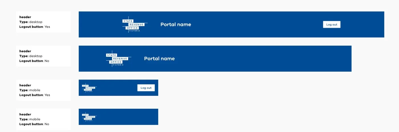
The component covers desktop and mobile, each with and without a log out button, and shows the portal name next to the SRO logo.

Four versions of the SRO header in blue: desktop with a log out button, desktop without, mobile with a log out button and mobile without
The header: desktop and mobile, with and without log out

The login card: deciding it was not a component

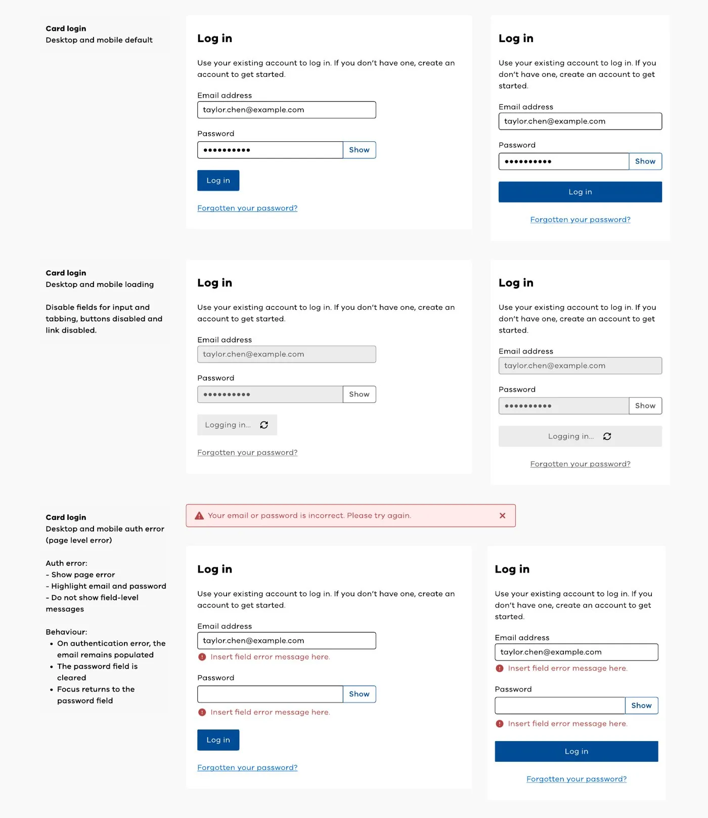
As part of a new customer portal project I spent a lot of time on the login card, including discussions with the security team. I specified the default, loading, authentication error and field validation states for desktop and mobile. After the discussions we decided it should not be a component at all, because login would probably differ across our apps.

The decisions behind the spec:

  • One page-level error for a failed login, with both fields highlighted and no field-level messages, so the screen does not reveal which detail was wrong
  • After a failed login the email stays filled in, the password is cleared and focus returns to the password field
  • While logging in, the fields and the link are disabled and cannot be tabbed to, and the button shows its progress
  • A show control on the password field, and a separate register card for new customers

I count that as a good outcome. A design system is not a library of everything, and knowing what to leave out keeps it maintainable. The spec still stands as a pattern for teams to follow.

Login card designs for desktop and mobile showing the default, loading and authentication error states
Login card: default, loading and authentication error states

Governing the library as a product

We do not version individual Figma components the way developers version code. We treat the whole Figma library as one versioned product, with formal releases, changelogs and governance, and releases aligned to the Angular releases.

  • Semantic versioning, so teams can tell a breaking change from a small fix
  • Branches for new components: 30 components so far, three of them in active design
  • A design-to-code mapping that links each Figma component to its Angular counterpart
  • Changelogs with every release, so teams know what moved

The link between design and code is maintained by people, not tooling. There is no Storybook, MCP or automated design-to-code integration yet.

Where it gets hard

New features land in apps that still contain old components, so old and new run side by side. We keep the familiar look and feel and make subtle changes in line with Ripple, so the two sit together coherently.

The longer-term challenge is keeping the library maintainable as more teams adopt it. Teams give the HCD team feedback on the components they use, so we can see how they are used and taken up, improve them, and make sure they cover the needs of the teams building with them. That feedback loop is what lets the library scale beyond its first project.

What the retro said

When the build ended, the development teams and the UX team held a retro. The library was delivered on the committed date, as part of the wider Angular component library upgrade. The overall feedback was very positive.

  • Early planningDefining scope early kept expectations clear and aligned from the start.
  • Close collaborationShared ownership and open communication across the teams.
  • Responsive peopleQuestions and issues were dealt with quickly, which kept momentum up.

Challenges came up along the way. Flexibility and weekly check-ins got us through them, including when the planned tester became unavailable and two colleagues stepped in to test.

Two opportunities for next time: dedicated developer time to cut context switching, and connecting Figma to Angular through MCP or a similar tool.

Where it stands

The first project to use it is a new portal, and I designed its dashboard. I built the Figma prototypes for user testing with an external vendor, sat in on every session and contributed to the synthesis.

The dashboard, built with the new components, was usability tested. It scored 6 out of 7 for ease of use and 78 on the System Usability Scale.

Back to top ↑

Case study · Product design

Qantas rebooking for disrupted flights

I reviewed and usability tested the live rebooking tool that a third party supplied to Qantas, then designed the interface and flows for Qantas's own version, built on its own APIs and design system.

Role
Senior Product Designer, contract, remote
Period
Dec 2021 to Feb 2024; this project from Sept 2022
Team
Agile team of about 20, onshore and offshore, including a lead product designer
My work
UX review, moderated usability testing, user flows, interaction and interface design, applying the trips model to rebooking
Built on
Qantas Runway design system

The problem

When a flight is cancelled or changed, customers can choose new flights themselves online. Internally it is called self-reaccommodation. Qantas used an out-of-the-box product from a large overseas supplier, with Qantas branding on top. It worked, but it ran on the supplier's release schedule and was designed for a global audience.

Qantas wanted something that worked for its own customers, so the idea was to decouple: keep the supplier's APIs, but build a Qantas front end using server-driven UI components and the Runway design system.

Step one: review and test the live tool

Before any redesign I reviewed the live portal over a few days, then met the product team and planned a round of testing. I also built a mobile-friendly concept in Figma to test against the live mobile version.

In September 2022 I ran eight moderated remote sessions, with participants recruited through Askable. All had flown in the past year and all but one had been through a disruption. They tried two scenarios, a single flight change from the disruption email and a return journey. Everyone completed the flow, including changing more than one flight in a trip, so this was a case of making a working tool clearer rather than fixing a broken one.

  • 8 of 8completed the flow, including changing several flights
  • 6 of 8missed where the original flight sat on the page
  • 8 of 8wanted to know the cost, though it was stated in three places
  • 5 of 8found the next steps on the confirmation page unhelpful

Other findings: people changed flights on the original date to limit knock-on disruption, most expected compensation for a downgrade such as a Jetstar flight, and most liked the histogram on desktop but not on mobile. They preferred a simple list of dates and flights on a phone. I reported the findings with specific UI recommendations, down to type sizes and colours, so they could be matched to Runway.

Step two: what customers needed from a bespoke version

I led the research for the new version, and concept testing pointed to six needs. They became the brief for the redesign.

  • Let me decideHelp me make an informed choice instead of choosing for me.
  • Show me what changedTell me how the new flight differs from the one I booked.
  • Fewer stepsSay what went wrong, what you have done and what I need to do.
  • Big issues firstProgressive disclosure, with the detail after.
  • Tasks, not informationShow me my options and make them self-explanatory.
  • Think about my whole tripA disruption affects more than one flight.

The aim became to present the right information at the right time: surface what the customer can do next, rather than everything we could not do for them.

Choosing a new flight

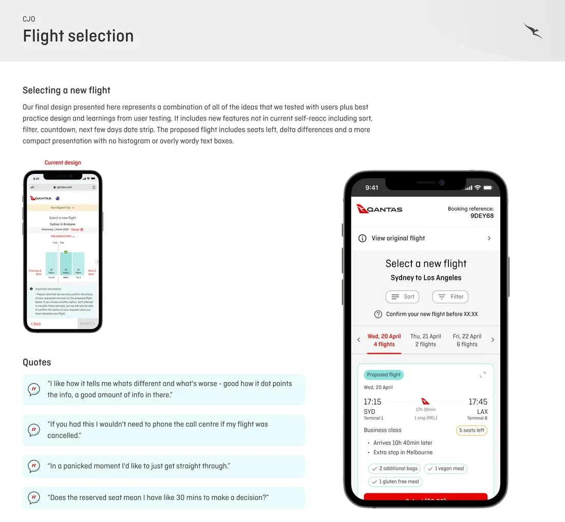
In the bespoke design I combined every idea that tested well with best practice. It added sort, filter, a countdown and a date strip for the next few days. The proposed flight shows seats left and what is different from the original booking, on a more compact card with no histogram or wordy text boxes.

I tested other options too: a recommended and all-flights toggle, vertical and horizontal flight cards, flight counts per date, and fast filters. People liked fast filters such as best flight, earliest arrival and direct flights, which reflected a need to reach the destination as soon as possible. Some asked to filter by business class so they would not compromise their travel class. One tester said that with this tool they would not need to phone the call centre if their flight was cancelled.

The Qantas flight selection board, with the current design beside the new mobile design and four customer quotes
Current design, the final design and what testers said

Designing the disruption flow

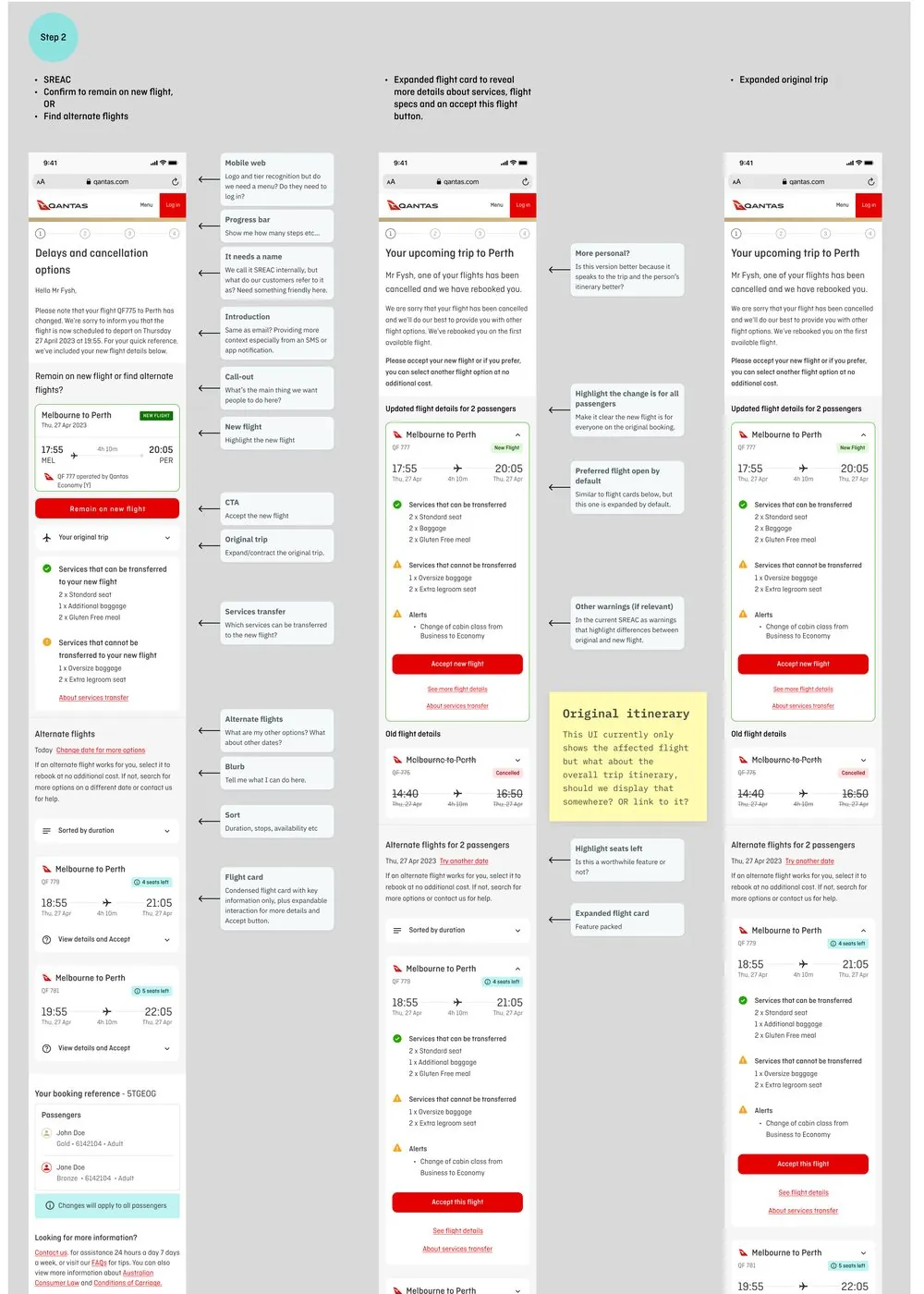
The annotated designs explain the reason for each element, from the email and landing page to the flight card, the original trip and how services transfer to the new flight. They also keep the open questions in view, such as whether to show the overall trip itinerary on this screen or link to it.

Annotated mobile screens for a cancelled-flight page, with a note explaining each element
Annotated screens for a cancelled flight

Adding rebooking to the trips model

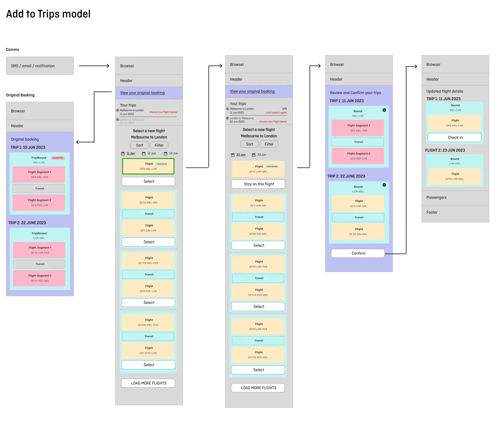
A disruption often changes one flight inside a longer trip. Another designer at Qantas had defined a trips model for the whole booking: a booking holds bounds, a bound holds flights, and a flight can have segments. I used that model to design the rebooking flow, so it works for one-way, return and multi-city bookings.

The flow starts from the original booking, with the disrupted bound marked. Customers see a "Your trips" summary and choose a replacement for each bound in turn, with the proposed flight highlighted. A single review and confirm screen shows every trip before they commit, and the updated booking leads straight to check-in.

A wireframe flow of the add to trips model: the original booking with a disrupted bound, selecting a new flight for each trip, reviewing and confirming all trips, then the updated flight details with check in
The add to trips model for rebooking: original booking, select, review and confirm, updated details

Where it stands

I have no results from the bespoke version to share, so I will not claim any. What I can show is the evidence behind the design: a tested review of the live tool, six customer needs that shaped the brief, and a complete flow designed in the Runway design system.

Also at Qantas: the digital boarding pass

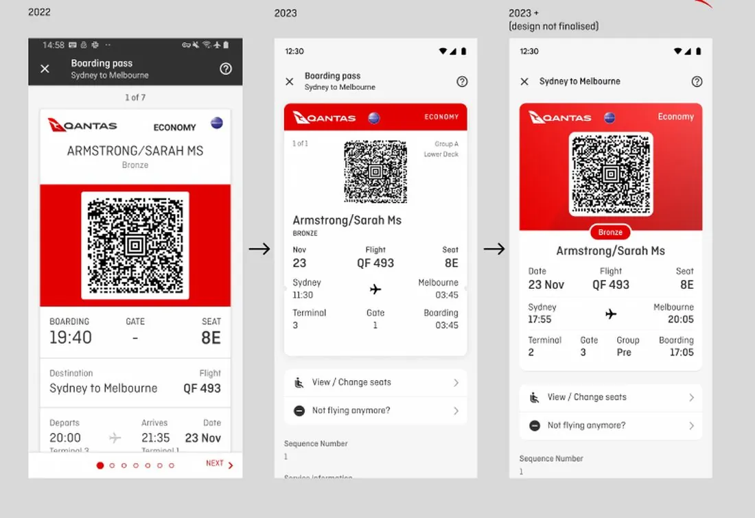
Working with another senior product designer, I worked on two releases of the boarding pass, which travellers use every day. The 2023 version improved the layout, and the next stage gave the pass more brand character. Changes included a more prominent tier label and name, a boarding group, a date, clearer rows and a card shadow in place of a floating one. Together we designed every tier across iOS, web and Android.

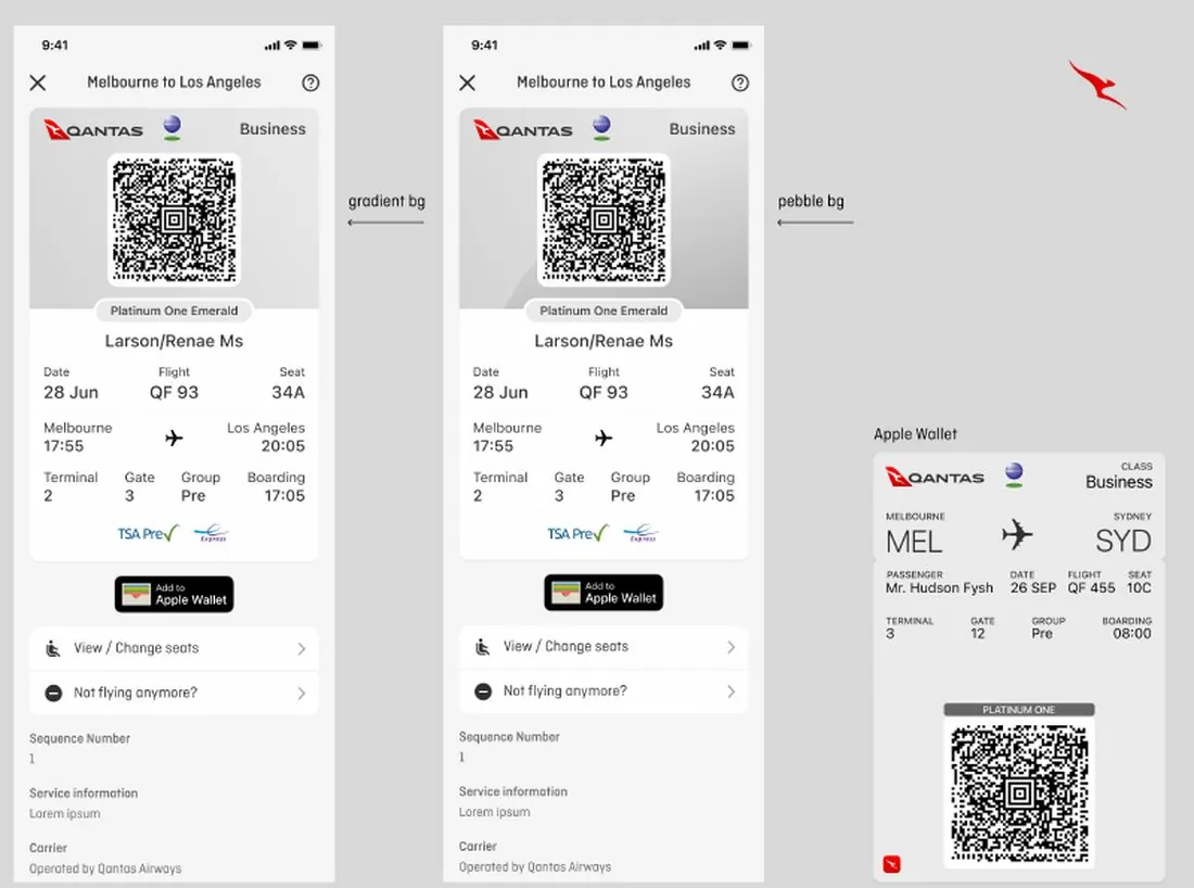
The open question was background. We set a tier-coloured gradient and a neutral pebble side by side, with the Apple Wallet pass for comparison, and put the choice to brand. The pass is now live with a subtle change: a flat background colour taken from the brand palette, with no gradient or pebble.

Three Android boarding passes: the 2022 web version, the 2023 app version and a later iteration
From the 2022 web pass to the 2023 app and beyond
Two iOS boarding passes for a Platinum One tier, one with a gradient background and one with a pebble background, beside an Apple Wallet pass
Gradient and pebble options explored; the live pass uses a flat brand colour

Also at Qantas: passport scanning

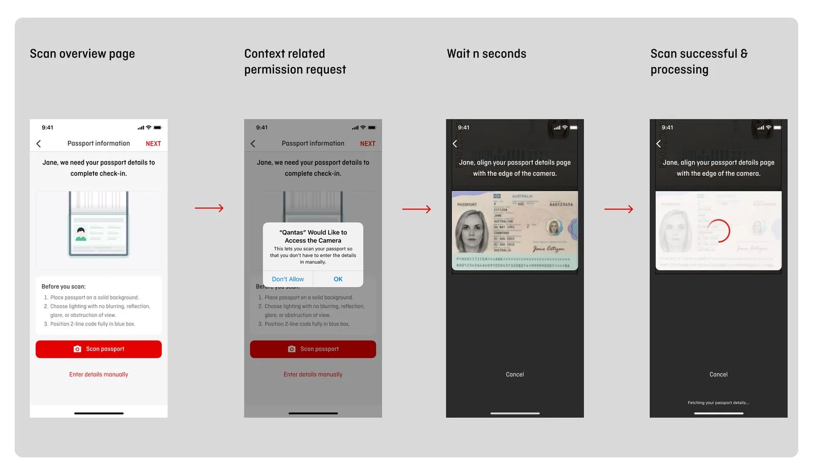
I designed this one on my own. It is the latest work and is now live, and it lets customers scan their passport in the app at check-in. The happy path starts with an overview and a short list of tips, asks for camera access in context with a reason ("so that you don't have to enter the details manually"), guides the scan and shows progress. Customers skip straight to the passport form if their details are already filled in, their phone cannot scan, or they choose to enter details manually.

Four mobile screens: the passport scan overview, a camera permission request, the camera view and a successful scan processing
Scan overview, camera permission, scanning and processing

Back to top ↑

Case study · Product redesign

Maxxia member portal

A self-service site for 50,000+ members, redesigned in 12 months with one UX designer. The hardest screens were the ones where members ask to be reimbursed.

Role
Senior UX Designer, the only one on the project. Contract, then permanent.
Client
McMillan Shakespeare Group, Melbourne
Team
Second person in a new digital team. One developer, then a business analyst, in a distributed agile team of about 10.
Delivery
12 months, then two follow-on projects
Scale
200+ responsive screens
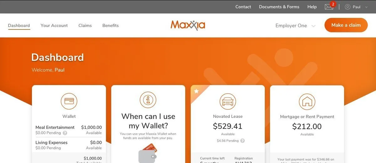
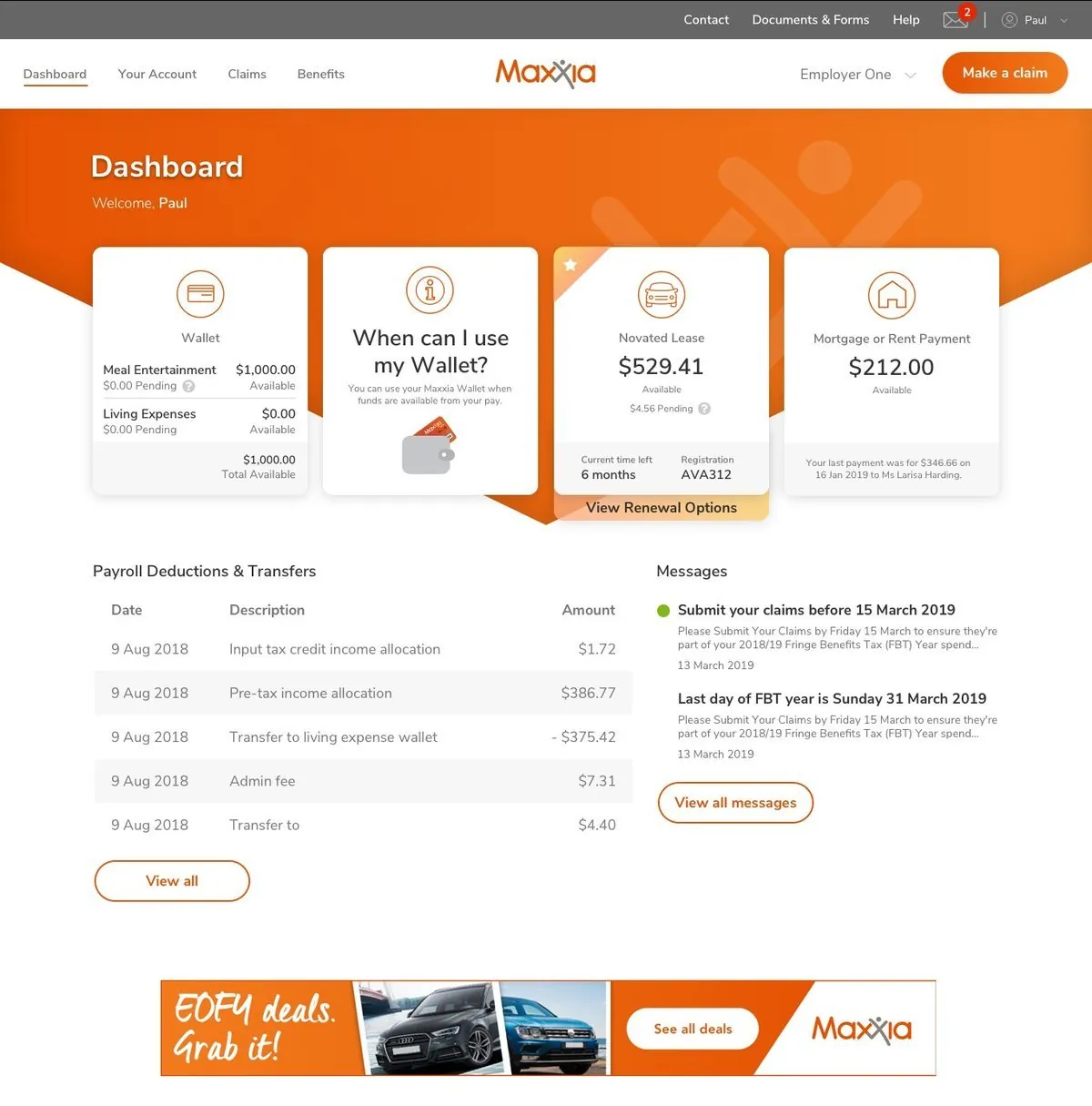
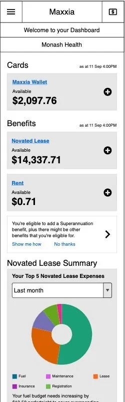
The final Maxxia dashboard on desktop, with wallet, novated lease and rent or mortgage cards, a View Renewal Options prompt, payroll deductions and messages
Final dashboard on desktop
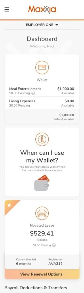
The same Maxxia dashboard on mobile, with the cards stacked in a single column
The same dashboard on mobile

The problem

Maxxia is where members view their benefits and financial data online. The site was hard to use, did not work well on mobile and had not had a styling update in a long time.

The business wanted simpler financial data, an easy path from the public site to the private one, and room to cross-promote other products. Key tasks, such as claiming reimbursement for an expense, needed a better flow.

Research

I started by watching how people really used the site. Anonymous clickstream recordings covered every member who logged in, and I analysed hundreds of them.

Patterns showed where members struggled. A bank account format error forced them to re-enter their details. A mobile password screen kept shifting while an error message stayed on screen. Some members went from the dashboard straight to the contact page and the phone number, which raised the question of why they were calling.

Stakeholder interviews, contextual enquiries, workshops, user flow analysis, usability testing and surveys then filled in the reasons.

Two calls I made early

  • Horizontal navigation over verticalMy first designs put navigation on the left. Research on the two options was inconclusive, so consistency with the new public site decided it.
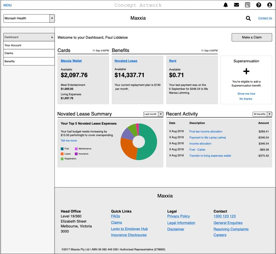
  • A chart held backA Novated Lease Summary chart was cut from the first release. The dashboard already made many server calls, and the chart would have slowed page load until the business had an intermediary data warehouse.
An early desktop wireframe of the Maxxia dashboard with left-hand navigation and a lease summary chart
Early wireframe with left navigation and the lease summary chart
An early mobile wireframe of the Maxxia dashboard
Early mobile wireframe

The claim flow

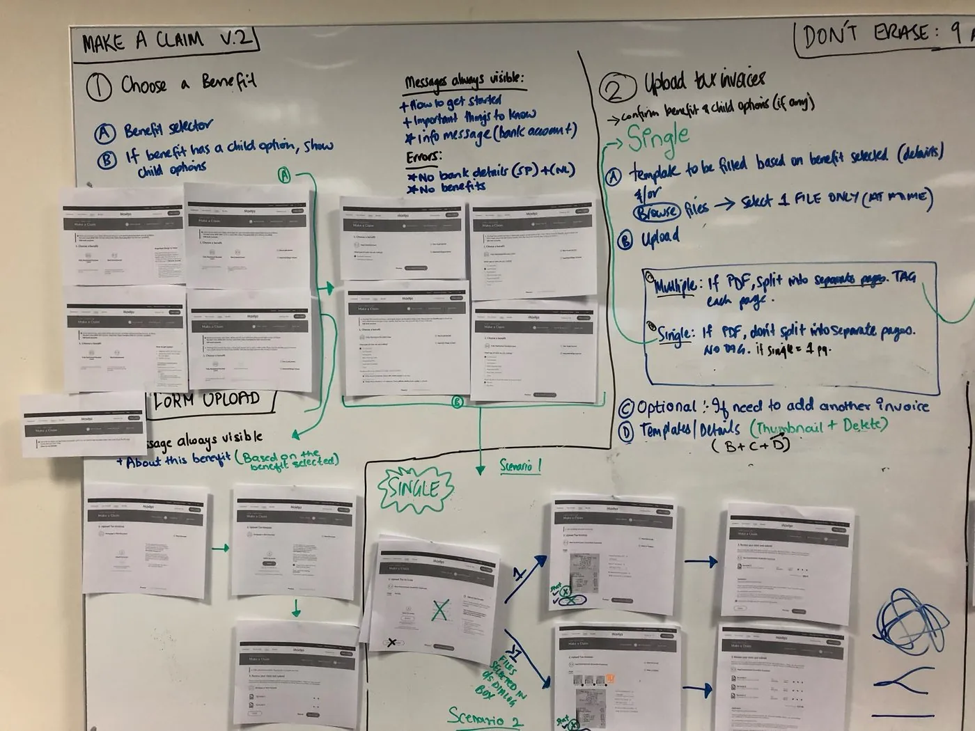
Members and staff called making a claim clumsy, awkward and confusing. I spent months refining it with the developers and stakeholders. We printed the proposed screens and mapped them as a flow on a whiteboard, so stakeholders could judge the whole journey at once.

  • Clearer instructions and alert messages
  • Two upload options instead of three
  • Clearer bank account information, with links from Make a Claim to the bank account update
  • Fewer screens and steps
  • Existing bugs removed
A whiteboard covered with printed Make a Claim screens, linked by hand-drawn arrows and notes into a flow
Printed screens mapped as a flow on the whiteboard
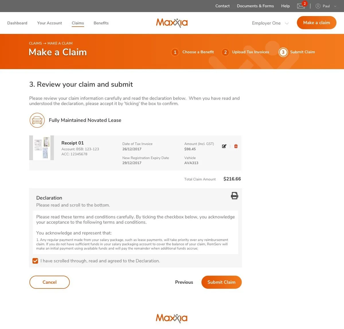
The final Make a Claim review step, showing a receipt, a declaration to read and a Submit Claim button
Final review step of the claim

Building the system

I created a design system in Sketch, starting with a style guide for the whole application, with UX help from OutSystems in Portugal. It served responsive desktop and mobile across 200+ screens, and keeping bespoke widgets to a minimum sped up both design and development.

For the first few months I worked closely with a single developer, until a business analyst joined. I had no experience with OutSystems, the platform the site was migrated onto, so I learned it while getting to know the business and its users.

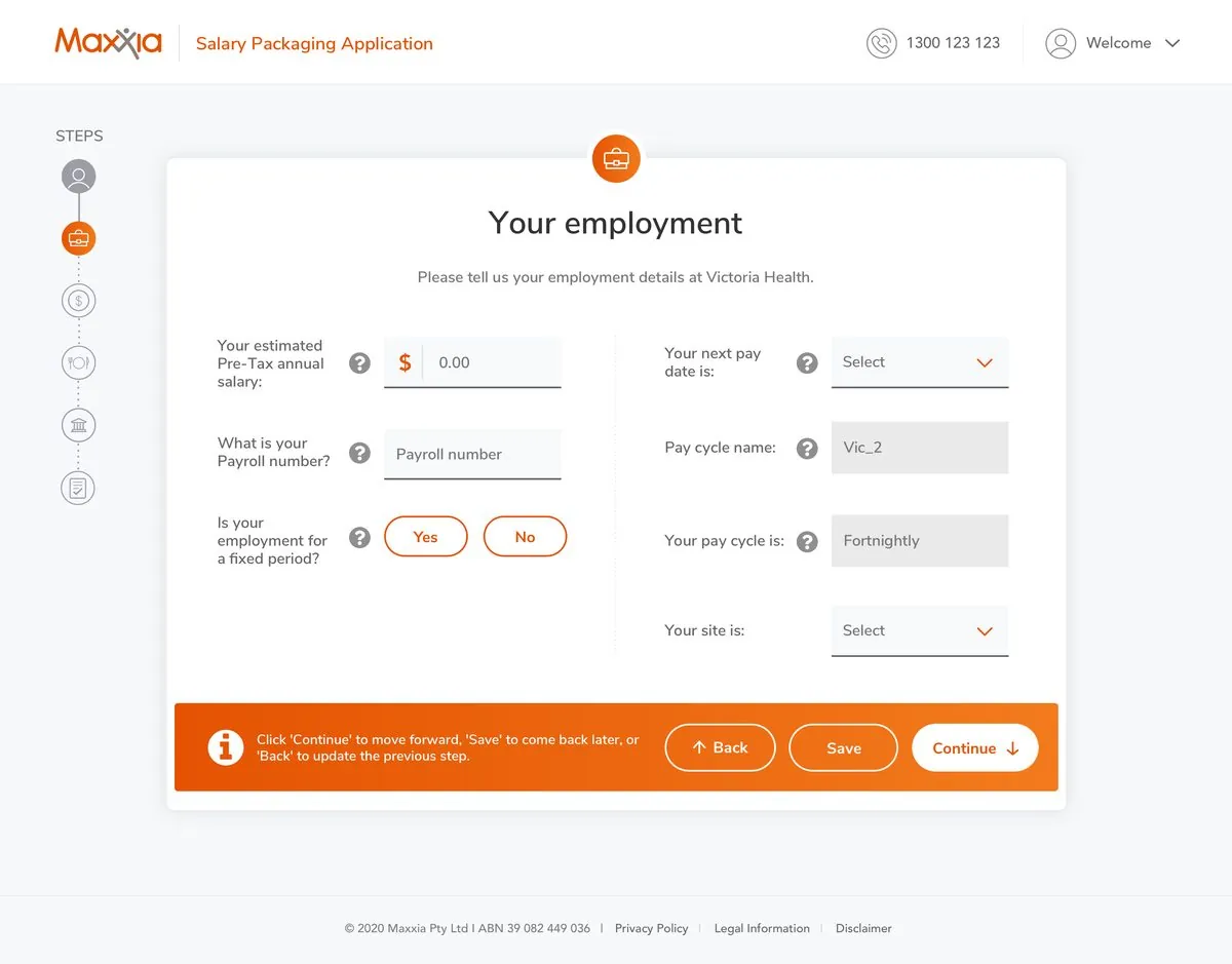
A step in the Maxxia salary packaging application, with a step indicator and fields for employment details
A step in the application form
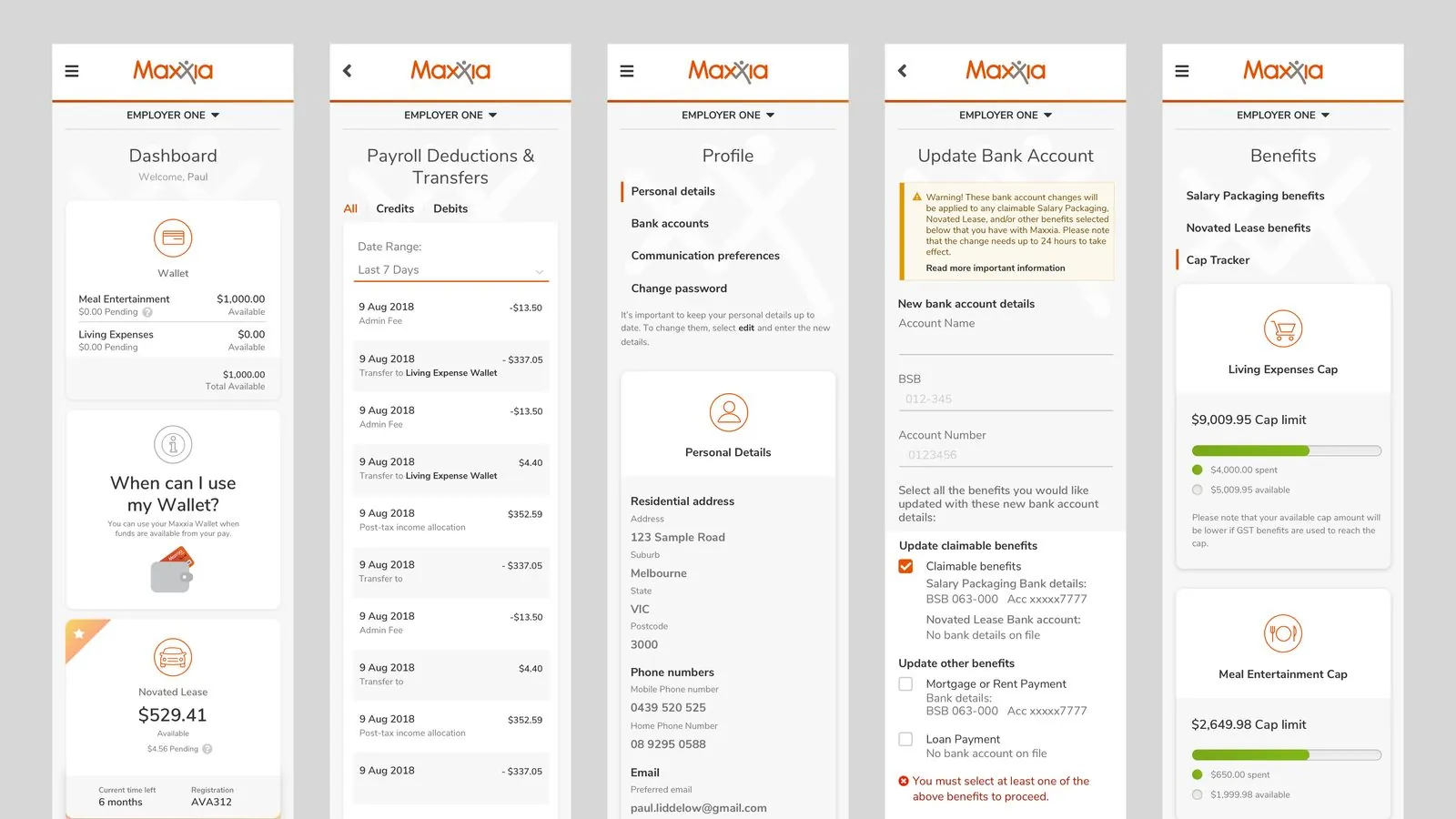
Five Maxxia mobile screens: dashboard, payroll deductions, profile, update bank account and benefits caps
Mobile screens built from the same system

A consent flow after regulator guidance

The financial regulator issued guidance on capturing clear customer consent for add-on insurance, and was considering making it mandatory for dealers and novated lease providers. The insurance licence holder asked us to change the sales process to match. Add-on insurance was a solid revenue stream, and the business worried that a new consent step would put customers off.

I started with desk research and a competitor review, then wireframed two concepts and tested them remotely with ten people who were considering a novated lease, mixed by sector, age and gender. We wanted to know whether people would remove the insurance, whether they understood the products, and whether they wanted to see pricing up front.

  • Show the pricePeople wanted to see cost, and wanted the total rather than an "estimated" figure, a word that confused them.
  • Keep them on the pageOpening a separate tab to read product information put people off, and so did SMS validation.
  • Price decidesPeople said they would add the insurance if the price was right, and would remove it only if the cost was unreasonably high.

The second concept won overall. I fixed the unclear email calls to action, the confusing icons and a confirm button with poor colour contrast, then produced production-ready designs from the brand guidelines and the customer experience team's design system.

A later phase placed consent inside the customer's wider journey: what they see after accepting a proposal, and on their home page, depending on which steps they had finished. Government requirements for optional insurance meant a four-day wait after the finance application, so the consent step appears first but stays inactive until the wait is over. I designed the messaging for each state. It was built true to the design, and in the early pilot the business did not see a significant drop in sales of these products.

Getting a design-first approach accepted

As one of the first UX designers at the group, I had to show the value of user-centred design before the project started and again along the way. I set out a plan of activities, ran contextual enquiries and user testing, and held regular staff workshops to show my research and designs.

Stakeholders said they enjoyed being part of the design process, which they had not been before. After I left, the business hired two UX designers to continue the work.

Design checkpoints in the workflow

With the business analyst, I added a design checkpoint after each user story was developed. Design bugs were caught and fixed before QA, which helped the testers, who were mostly offshore in a different time zone. I also brought developers and testers into design discussions so their system knowledge shaped the result.

A follow-on: Fleetview

One of the two follow-on projects was a three-month redesign of Fleetview, an outdated internal application for the group's Asset Management team. I ran an expert review of the existing system, contextual enquiries with four internal users and interviews with three key users, then worked with stakeholders to refine wireframes from low to high fidelity. I designed 12 key screens and the supporting components, from sketches through to high-fidelity mockups in Sketch.

Results

Members got a fully responsive interface that was consistent with the group's digital experiences and branding. A before and after System Usability Scale survey of desktop users scored the new site at about 66, a few points higher than the old one and close to the commonly cited average of 68. Staff and member feedback was very positive.
  • Over $60kin potential leads in the first few days from View Renewal Options, a feature for novated leases
  • About 66System Usability Scale score from desktop users, a few points up on the old site
  • 12 monthsto deliver a new design from scratch on a new platform

Stakeholders thought the renewal options design was too basic and wanted more context up front. I argued it was basic on purpose: get something live fast, test the market response and iterate as data came in. The early numbers backed that up.

Back to top ↑

Earlier work

Shorter write-ups, including the ones that ended in a surprise.

About

I design the rules so everyone else can move fast.

The thread through more than fifteen years in UX is the system behind the screens. At Deakin I helped build a design system with my UX Design Engineer, whom I managed. I set one up for Maxxia, worked inside Qantas Runway, and now maintain the SRO pattern library.

I treat accessibility as a design input, not an audit at the end, and I care about the human side of governance: who owns a component, how a change gets approved, how teams get brought along. With help from my team, I ran a UX Champions program at Deakin. Today I train other designers in the SRO pattern library and coach colleagues on Figma practice.

I started in print advertising at Sensis and moved into UX early in my career. I hold a Bachelor of Multimedia Information Systems from Murdoch University in Perth, a Master of Internet Studies in Internet Design from Curtin University and a Nielsen Norman Group UX Certification.

  • Make the right thing the easy thing.Patterns should be quicker to use than to ignore.
  • Test before you build.A prototype that fails in a session is cheaper than a feature that fails in production.
  • Keep a little bite.Systems can be rigorous and still have a point of view.
Previously Qantas Aesop Deakin Eventbrite 99designs